
TranceAddict Forums (www.tranceaddict.com/forums)
- Music Discussion
-- Poorly designed album covers
Pages (3): « 1 2 [3]
| quote: |
Originally posted by paulandrews   |

| quote: |
| Originally posted by trancepunkk all pvd, tiesto and avb covers deserve mention in this thread really... |

Makes me glad I'm not from the West Country...

| quote: |
| Originally posted by Prototrance But if you look at the superb artwork on FSOL albums since (apart from ISDN maybe), its a bit of a rubbish cover. |


| quote: |
| Originally posted by SYSTEM-J Muh? To me, The FSOL's artwork has always looked crap. Most of it looks like exactly what it is: painfully dated computer-generated bollocks. Seriously, the guy's head leering out of Dead Cities? Or the badly-inserted anemone on the front of Lifeforms? |
| quote: |
| Originally posted by pvdAngel I don't agree that all their album artwork should be classified as poor. What's wrong with the design for PoD1, Reflections, or AvB's 76 (the coloured one)? I know Tiesto's are a bit minimal and this one: ... definatly creeps me out! |
man those are some bad ones. I just picked up the new Shins "Wincing The Night Away" and as much as I love the record I can't dig the cover. Oh well. I've been listening to Mew's "And The Glass Handed Kites" alot lately and I keep falling in love with it every time I hear it. I just make sure not to look at the cover too much because it is just weeeeeird dude. check it out...

A new one!
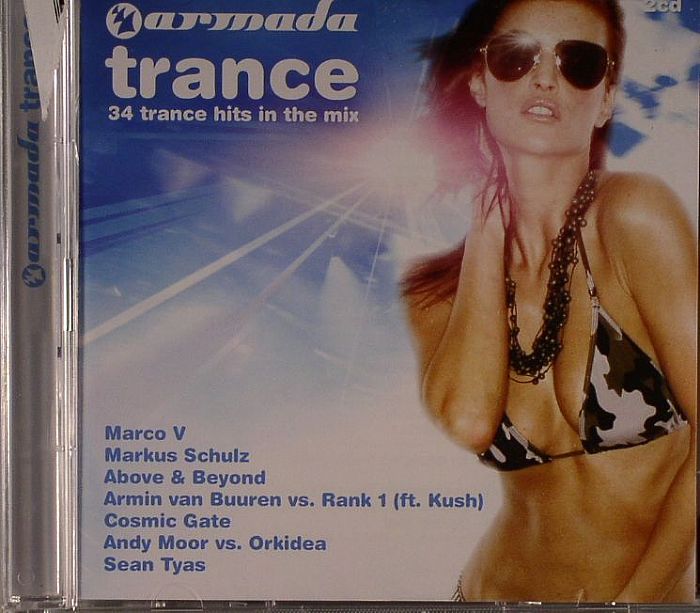
And some still try and claim AvB isn't commercial!? This is the type of cover you find on something titled like Ultra Dance Hits 2006 or Ibiza Dance Heaven '05.
| quote: |
Originally posted by DJ Patski  Where's the effort.. |
when i saw the title of this thread, i just couldnt resist reading it
some of the covers posted = total lollage 
| quote: |
Originally posted by pvdAngel  |
| quote: |
| Originally posted by pvdAngel I don't agree that all their album artwork should be classified as poor. What's wrong with the design for PoD1, Reflections, or AvB's 76 (the coloured one)? I know Tiesto's are a bit minimal and this one: ... definatly creeps me out! |
| quote: |
| Originally posted by sherifyosti beside useing too effort to become in this |
any of tiesto's forbidden paradise albums. looked like something from the Nature Company
Powered by: vBulletin
Copyright © 2000-2021, Jelsoft Enterprises Ltd.