
TranceAddict Forums (www.tranceaddict.com/forums)
- Chill Out Room
-- The ongoing TranceAddict tshirt soap opera continues....
Pages (2): [1] 2 »
The ongoing TranceAddict tshirt soap opera continues....
 Ok... Looks like I'm going to be switching logos... I wanna hear some input though with regards to the shirts cuz I wanna get em done it's been on the back burner too long.
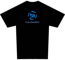
Magnified so u see what's on the shirt (ignore the blur)  :
:

Ignore the color disparity between 'tranceaddict' and the circular "ta-dot" logo thing - that'll be fixed up so they match... Also concerns about the blue being hard to see on a black tshirt will be dealt with since we can just lighten it up a bit for print on the black and leave it darker for the white tshirts....
What y'all think?
i really like that design i think the blue looks very cool maybe even a green in that shade? that would look awsome.
but i still reckon on a totally unrelated note there should be a simple black t shirt with say tranceaddict printed on the front (In simple bold white writing) and the logo on the back around the base of the neck... or trance on the front and addict on the back keep it simple though that rocks!!!!!!!!!!!!
http://www.tranceaddict.com/forums/avatar.php?userid=2&dateline=1020058807
I knew you were gonna let us have the new logo! woohoo!!!! I love the idea of the new logo, but would really like the shiney logo tha you use if possible.
I'm not sure but I see your avatar and then see the tee-shirt logo and I really like the avatar better. Could that be used? Either way, I'm glad you're giving us the new TA logo!
Payce
I think u should make the logo i bit bigger on the t shirt so then its easy to see. But despite the fact how muc will it cost b cuz i realy wanna buy it
I hate how much it costs to get Tee's made. I like the icefire blue. very cool. Something just isnt ringin true about it though...size is a little off, but circles are very closing symbols. If you had it radiating more towards the outside it might draw more attention.
my 2 golden cents of genius
actually this is my favorite design by far!
maybe add a little something on the sleeves? maybe the frog or something lol
| quote: |
| Originally posted by Swamper it's been on the back burner too long. |

| quote: |
| Originally posted by Swamper Also concerns about the blue being hard to see on a black tshirt will be dealt with since we can just lighten it up a bit for print on the black and leave it darker for the white tshirts.... |
| quote: |
| Originally posted by Jah but i still reckon on a totally unrelated note there should be a simple black t shirt with say tranceaddict printed on the front (In simple bold white writing) and the logo on the back around the base of the neck... or trance on the front and addict on the back keep it simple though that rocks!!!!!!!!!!!! |
| quote: |
| Originally posted by 69 KrAzY G 69 I think u should make the logo i bit bigger on the t shirt so then its easy to see. But despite the fact how muc will it cost b cuz i realy wanna buy it |


cool cool..but I do like the avatar better than the logo...if it makes a difference
the new logo is better than most other ideas!
i honestly don't like the new logo..
i think it looks aweful on the shirt. Sorry that i do not have an alternative...
i think the new logo looks great on the t-shirt, nothing more too say
The logo looks great! Just make it a bit bigger I want the text
"The
real
answer
never
comes
easily
almost
defying
definition
it's
called
trance"
on the backside of the t-shirt! That would looks soo cool!
//DJ_A
Cool design! But i want my TA name printed on the back!
That would be so fucking awesome!
yep, the TA name on the back would do the trick
I think I know what I'm going to use as a font for my name...
| quote: |
| Originally posted by drizzt81 i honestly don't like the new logo.. i think it looks aweful on the shirt. Sorry that i do not have an alternative... |
I like the look of this t-shirt !! When & where can i get it ?
How will this fit into the girlie T-shirts??
I like the new logo.
ok people heres my version of the shirt with the new logo
looks simple i guess oh well
Front:

back:

the new logo is sweeeeeet
I think possibly the normal design on the front and that on the back, or the other way round. But i think there is a place for both.
Maybe the old design, and the dot on the back would look good Without the tranceaddict
wow... it totally ownz!! it rocks.. can�t wait to get one... How much will it cost for the shipping to germany ??
??
swamper..instead of making the blue brighter, put a hint of a white glow around it
 oy
oy
looks sweet swamper. i'm gonna buy one if you decide on this current logo
Pork!
i think its quality idea! i love the new logo!
so much a made a special TA logo on my website from it to link to TA

I like the new logo too
I dont know if it would be possible, but are you able to make a black shirt, with a logo that only appears when shown under a blacklight? Dont know if anyone would be interested in that, but I would.
Just a thought

Powered by: vBulletin
Copyright © 2000-2021, Jelsoft Enterprises Ltd.