The ongoing TranceAddict tshirt soap opera continues....
Ok... Looks like I'm going to be switching logos... I wanna hear some input though with regards to the shirts cuz I wanna get em done it's been on the back burner too long.
Magnified so u see what's on the shirt (ignore the blur) :
Ignore the color disparity between 'tranceaddict' and the circular "ta-dot" logo thing - that'll be fixed up so they match... Also concerns about the blue being hard to see on a black tshirt will be dealt with since we can just lighten it up a bit for print on the black and leave it darker for the white tshirts....
What y'all think?
___________________
"In a world of illusion you only see what you feel"
May-27-2002 03:05
Jah
i just want to wear a hat
Registered: Nov 2000
Location: Australia, Perth
i really like that design i think the blue looks very cool maybe even a green in that shade? that would look awsome.
but i still reckon on a totally unrelated note there should be a simple black t shirt with say tranceaddict printed on the front (In simple bold white writing) and the logo on the back around the base of the neck... or trance on the front and addict on the back keep it simple though that rocks!!!!!!!!!!!!
I knew you were gonna let us have the new logo! woohoo!!!! I love the idea of the new logo, but would really like the shiney logo tha you use if possible.
I'm not sure but I see your avatar and then see the tee-shirt logo and I really like the avatar better. Could that be used? Either way, I'm glad you're giving us the new TA logo!
Payce
___________________
"The mind is like a parachute, it works better if it's open."
May-27-2002 03:42
69 KrAzY G 69
Senior tranceaddict
Registered: Jan 2002
Location: Toronto/Mississauga Underground
I think u should make the logo i bit bigger on the t shirt so then its easy to see. But despite the fact how muc will it cost b cuz i realy wanna buy it
___________________
May-27-2002 04:36
Orbax
Supreme tranceaddict
Registered: Apr 2002
Location:
I hate how much it costs to get Tee's made. I like the icefire blue. very cool. Something just isnt ringin true about it though...size is a little off, but circles are very closing symbols. If you had it radiating more towards the outside it might draw more attention.
my 2 golden cents of genius
May-27-2002 04:45
PhaseFour
Big Bad Bald Asian Guy
Registered: Apr 2001
Location: Sacramento and/or UC Davis, California
actually this is my favorite design by far!
maybe add a little something on the sleeves? maybe the frog or something lol
___________________
May-27-2002 04:57
Tranex02
/confused
Registered: May 2001
Location: United States
quote:
Originally posted by Swamper
it's been on the back burner too long.
yea....
quote:
Originally posted by Swamper
Also concerns about the blue being hard to see on a black tshirt will be dealt with since we can just lighten it up a bit for print on the black and leave it darker for the white tshirts....
I don't think that's a really a problem, but i think it's a very good idea....much simpler.
quote:
Originally posted by Jah
but i still reckon on a totally unrelated note there should be a simple black t shirt with say tranceaddict printed on the front (In simple bold white writing) and the logo on the back around the base of the neck... or trance on the front and addict on the back keep it simple though that rocks!!!!!!!!!!!!
yea, that's also another thing to really consider...
no frogs!
quote:
Originally posted by 69 KrAzY G 69
I think u should make the logo i bit bigger on the t shirt so then its easy to see. But despite the fact how muc will it cost b cuz i realy wanna buy it
i don't think it should be too big cuz then it looks kinda cheesy...keep it cool.
I also want the shirts really bad..
I'll probably have to have it shipped to me while i'm away
BTW swamper, are you still getting the shirst from that company, the one where we chose the models we wanted.... ???
that's my opinion....
for some reason i found it essential to reply to all these posts...
___________________
May-27-2002 08:04
j_spot
retired
Registered: Mar 2001
Location: Calgary
cool cool..but I do like the avatar better than the logo...if it makes a difference
the new logo is better than most other ideas!
___________________
Retired TA.
May-27-2002 10:22
drizzt81
Professional Lamer
Registered: Nov 2001
Location: GTA #1 - At work
i honestly don't like the new logo..
i think it looks aweful on the shirt. Sorry that i do not have an alternative...


 Ok... Looks like I'm going to be switching logos... I wanna hear some input though with regards to the shirts cuz I wanna get em done it's been on the back burner too long.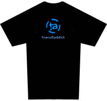
 :
:


