|
my gatecrasher poster (project for class) criticism pls
|
View this Thread in Original format
| Aya Brea |
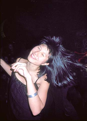
all right. i had to do an event/travel poster for school and immediately i wanted to do something involving the club scene. i desperately need opinions on it before i hand it in, and i thought this would probably be a good place to ask for them. most of the photo's i used in this i took myself (yeah theyre from roxy, but you can't tell so harhar). anything i should add? anything i should take out? thxuguys! 
(i know its huge)
 |
|
|
| Photo_bot_2k1 |
good except the font for the bottom text looks a bit off
btw i like your sig better than that poster
go stewie |
|
|
| wienerschnitzel |
| i also like it, good job! |
|
|
| jdat |
well nice job so far :D
but to go into details and "corrections" :
The person next to the "paul van dyk" should be blurred out a tad ... too crisp and visible compared to the rest of the poster ... unwanted attention.
As far as the usage of the logo you might want to make it more visible, I was thinking if you had it at a tilt covering a much larger area with proper usage of transparency it would emphasis more on the logo. The logo is after all visible in the poster 3 times and that's a tad over board when you consider that twice it's the exact same size ( or so it seems ) and the logo is always presented in a flat matter without any "play" ( tilts/angles etc ).
In an effort to try and keep the work coherent I suppose you thought it would be better to keep same fonts for "at heaven london GC march 24 04" and " pvd matt scott marco ashley ". The top "heaven GC date "looks great nice sizing and colour usage but the part with the headliners indicated looks kind of dull. You might want to push the size of these names and make usage of another font so interest is not lost when viewing these names. ( It's a question of "cool" and readibility ... I find it a tad hard to view these names tbh but hey I'm being picky :p )
And the bottom well ... find something else pleaseeee :toothless ... it looks way too thrown in and amateurish and you know it :happy2:
Congrats on this shannie you've got a very good base and with minimal corrections I'll give you an A+
jdat; the picky grader :p |
|
|
| Omegasox |
| quote: | Originally posted by Photo_bot_2k1
good except the font for the bottom text looks a bit off
btw i like your sig better than that poster
go stewie |
I agree, the font just seems to look off in relation to the rest of the poster. But if you're shooting for a promotional poster the text being easily read at a glance is more important than it being all flashy.
Otherwise, it looks awesome! Nice job. :) |
|
|
| Vivid Boy |
| i think u should add a space alien somewhere in there and a pizza |
|
|
| smokeape |
Well, you asked for criticism. Get rid of the dead figure as the centerpice of your jpeg and put something lively in its place like this...
:clown:
[[[smoke]]] |
|
|
| Aya Brea |
| quote: | Originally posted by smokeape
Well, you asked for criticism. Get rid of the dead figure as the centerpice of your jpeg and put something lively in its place like this...
:clown:
[[[smoke]]] |
no thx :)
jdizzle, thxu for the tips and the A+, there are alot of things that you mentioned that i had thought about but i think i left them due to laziness. i know i used the gc logo twice, i did resize one of them just so they wouldnt be the same thing used over again but i guess theyre still similar looking. i also thought it was best to use the same fonts, i always feel its some sort of rule but i guess i dont have to follow it. the text at the bottom is very plain because i wanted to be readable and i figured info like that didn't have to be fancy shmancy. :] |
|
|
| infinity HiGH |
| quote: | Originally posted by smokeape
Well, you asked for criticism. Get rid of the dead figure as the centerpice of your jpeg and put something lively in its place like this...
:clown:
[[[smoke]]] |
i disagree
it looks good. get rid of the gatecrasher logo by PvD's name though.
Whats up with the crappy lineup of DJ's though? :p |
|
|
| Aya Brea |
| i copied it from another flyer i saw. i really didn't care at that point, i just wanted to get some names on there |
|
|
|
|
