|
jukebox graphics -> enjoy! (pg. 11)
|
View this Thread in Original format
| Nautica |
Am I missing something?
No offence, but I fail to see how some kerned outer-glow text over stock photography is so amazing? :conf: |
|
|
| assassin8 |
| WOW These are amazing. How do you make them?? |
|
|
| dreamdecks |
Hey Nautica - Whats the point in going to all the bother of doing a reply just to diss his work?
I'd like to see you try and do something half as good as that.
And you obviously do like sum of them coz you wouldnt have went to the bother of looking through all the pages just to see the comments.
Keep up the good work DavanteS!
Dreamer:wtf: |
|
|
| stanymi |
| quote: | Originally posted by Nautica
Am I missing something?
No offence, but I fail to see how some kerned outer-glow text over stock photography is so amazing? :conf: |
YOU are amazing....
DevanteS makes a really good work...
If you wanted take a look for all these pictures, you could see that it' s very :eyes: :eyes: :eyes: :eyes:
I like it...
Again, again DevanteS |
|
|
| DevanteS |

thanks guys for all your support!
Ghostland f/sinead o conner - guide me god (pvd remix)
coming up next!!!!
booya! (remember, send me a pm/email if you want to be on my mailing list)
Pork |
|
|
| bluejay |
my 2 favs...
| quote: | Originally posted by DevanteS
 |
and...
| quote: | Originally posted by DevanteS

sorry for the typo..should be "SPEAK in sympathy" not speaking |
i like your work on these :D |
|
|
| Alccode |
Hey DevanteS,
Awesome stuff! I really enjoy your work, it's such a great idea!
The little "collage" you made above is perfect for wallpaper (I think - haven't tested it out yet). Was that your plan? Could you have different "sizes" for different resolutions?
Just some ideas - YMMV. |
|
|
| Nautica |
| quote: | Originally posted by dreamdecks
Hey Nautica - Whats the point in going to all the bother of doing a reply just to diss his work?
I'd like to see you try and do something half as good as that.
|
I'm not so stupid as to dis someone's work unless I can do better. Here's what I knocked up in a couple of minutes:
One of the biggest holes I could pic in Chris' work is that the text obstructs the subject matter of the photo, rather than flow around it like my demonstration.
Rather than slag it off I'd prefer to make some helpful suggestions. As mentioned, try to flow the text, also vary the fonts used. It's nice enough but some variety would look awesome. Maybe even take a standard font and modify it to create something unique.
Also take a little more care with alignment, so for example the "S" os "stone" sits directly inline under the "R" of "solar". Kerning letter pairs as well, in "sympathy" look at the gap between the Y and the M, then the M and the P. Consistant spacing is good and looks neat.
Here's a quick Black Hole sleeve I made.

Although the photo isn't that good (cheap camera) it's one I took myself in a club and I think it's pretty cool.
So to some up, DevanteS, good work, room for improvement! ;)
Hope you can amaze us all soon, including the picky ones! ;) :) |
|
|
| venomdx |
| great work, i especially like the art for speaking in sympathy |
|
|
| Dj_ExOn |
| quote: | Originally posted by DevanteS

 |
Really nice! My favs! |
|
|
| NY1004 |
| quote: | Originally posted by Nautica
I'm not so stupid as to dis someone's work unless I can do better. Here's what I knocked up in a couple of minutes:
One of the biggest holes I could pic in Chris' work is that the text obstructs the subject matter of the photo, rather than flow around it like my demonstration.
Rather than slag it off I'd prefer to make some helpful suggestions. As mentioned, try to flow the text, also vary the fonts used. It's nice enough but some variety would look awesome. Maybe even take a standard font and modify it to create something unique.
Also take a little more care with alignment, so for example the "S" os "stone" sits directly inline under the "R" of "solar". Kerning letter pairs as well, in "sympathy" look at the gap between the Y and the M, then the M and the P. Consistant spacing is good and looks neat.
Here's a quick Black Hole sleeve I made.
Although the photo isn't that good (cheap camera) it's one I took myself in a club and I think it's pretty cool.
So to some up, DevanteS, good work, room for improvement! ;)
Hope you can amaze us all soon, including the picky ones! ;) :) |
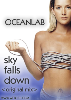
HEY I THINK YOU ARE MISSING A MAIN POINT HERE. DEVANTES HAND PICKS THE PICTURES TO MATCH THE SONG'S TITLE AND JUST THE GENERAL FEEL OF IT. WHEN I LOOK AT YOUR ABOVE GRAPHIC FOR OCEAN LAB IT IN NO WAY MAKES ME THINK OF OCEAN LAB.
GET IT?
HE NEVER SAID HIS GRAPHICS WERE THE BOMB. HE WAS JUST GRACIOUS ENOUGH TO SHARE THEM WITH THE TA COMMUNITY. SO PLEASE KEEP YOUR NEGATIVE COMMENTS TO YOURSELF. |
|
|
| Nautica |
| quote: | Originally posted by NY1004
HEY I THINK YOU ARE MISSING A MAIN POINT HERE. DEVANTES HAND PICKS THE PICTURES TO MATCH THE SONG'S TITLE AND JUST THE GENERAL FEEL OF IT. WHEN I LOOK AT YOUR ABOVE GRAPHIC FOR OCEAN LAB IT IN NO WAY MAKES ME THINK OF OCEAN LAB.
GET IT?
HE NEVER SAID HIS GRAPHICS WERE THE BOMB. HE WAS JUST GRACIOUS ENOUGH TO SHARE THEM WITH THE TA COMMUNITY. SO PLEASE KEEP YOUR NEGATIVE COMMENTS TO YOURSELF. |
What does Louise Nurding have to do with Chicane - Halcyon? Given time I could locate a suitably relevent photo for Oceanlab, I just picked the first girl that came to hand though.
You seem to be confusing "negative comments" with constructive criticism. Not once have said "that's crap" or suchlike, for each point I've made I've explained a way in which he can improve. Several times in the thread people have suggested he get into this further, and I'm pointing out ways in which he can maximise his potential. :)
How very selfish of me! ;) |
|
|
|
|
